Are you making any of these lettering mistakes?
Have you started brush lettering but are struggling? It might be due to one of the top 12 lettering mistakes to avoid that I share in this post. Read this post to discover how you can improve your brush lettering!
Lettering Mistake #1
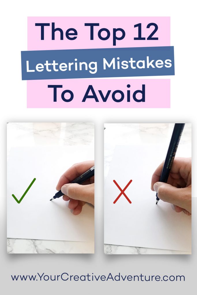
Holding your pen for lettering the same way you do for handwriting.
This is one of the most common mistakes I see people make when picking up a brush pen.
First of all, you want your pen to be at a 45-degree angle to the paper and NOT straight up and down. This allows you to use the entire belly of the brush pen when creating your thick downstrokes instead of the tip of the pen.
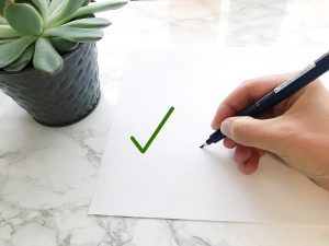
Next, the end of your pen and your hand should be to the side of your paper, not directly below it. Therefore, your pen will be perpendicular to the angle of your letters or at a 90-degree angle.

Both of these changes in how you hold the pen will allow you to have better control of your upstrokes, create thicker downstrokes, and avoid fraying your pens.
I also recommend watching my video on how to hold a brush pen here: https://yourcreativeadventure.com/how-to-hold-a-brush-pen/
Note: If you are left-handed, please refer to the this post: Left Handed Brush Lettering. However, many of you will be able to use these same tips to the opposite side.
Lettering Mistake #2
Going too fast.
I want you to think of letterings like drawing or illustration. Go slow and make deliberate strokes. Try to decrease your speed by at least half. Slow and steady truly does win the race with lettering.
Lettering Mistake #3
Thinking calligraphy and cursive handwriting are the same thing.
They are actually two completely different things. For example, in lettering, you lift your pen between each stroke whereas with cursive handwriting you use one fluid motion.
Lettering Mistake #4
Skipping the basic strokes and jumping right into words.
I know, I know. You want to get to the good stuff. I made this mistake myself when I first started brush lettering. However, when I started practicing my basic strokes consistently, I saw a dramatic improvement. It is similar to practicing your scales when learning a musical instrument. You’ve got to master the basics first.
Lettering Mistake #5
Comparing your artwork to lettering artists who have been doing this for years.
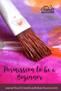
Be kind to yourself and allow yourself the freedom to be a beginner.
I and other lettering artists have been practicing for years. Therefore, it’s not realistic to expect your lettering to look like mine today. In order to improve, you have to be willing to put in the hard work and practice on a consistent basis. But, if you do practice consistently, you will improve. I promise!
For example, you can scroll back to some of my first lettering posts on Instagram (@yourcreativeadventure) to see how far I’ve come! It is truly amazing the improvement that comes with time.
Lettering Mistake #6
Trying to achieve perfect letters. Part of the beauty and charm of hand lettering is the fact that it is done by hand and is not perfect. If you want perfect letters, use a font on your computer. Embrace the imperfectly perfect.
Lettering Mistake #7
Inconsistency in your spacing or lettering style. Consistency is key. Not perfection, but consistency. Try to achieve even spacing between your letters,a similar weight of thickness with your downstrokes and consistency in the letterforms for each style you use.
Lettering Mistake #8
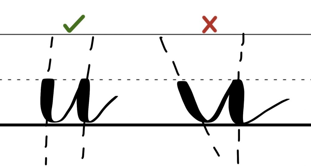
Creating letters with lines not parallel to each other.
For example, in the letter U, both sides of the U should be parallel to each other as seen in the image below.
Lettering Mistake #9
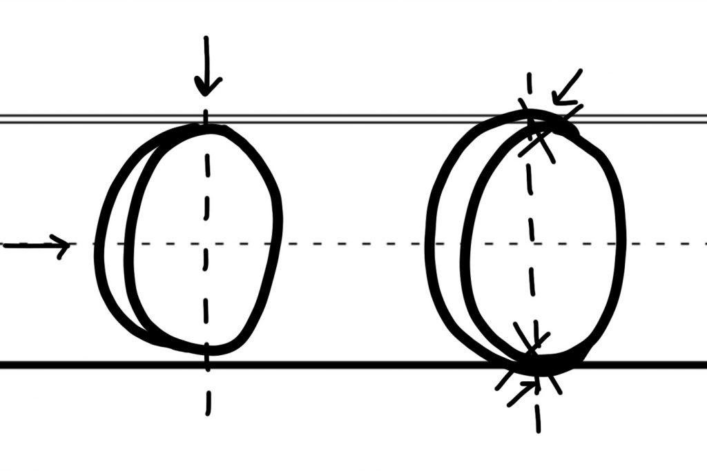
Extending the thickness of your downstrokes too far.
This is especially true for ovals. You want to imagine a line that divides each letter vertically as well as horizontally. See the example below.
For each letter, gradually add the thickness of the downstroke after the vertical midpoint. The thickest part of your letter will be around the horizontal midpoint.
Lettering Mistake #10
Using a bunch of different brush pens when you’re learning.
Each tool requires a different skill and slightly different muscle memory. Therefore, I encourage you to stick with one main tool in the beginning until you feel comfortable.
Lettering Mistake #11
Never trying other pens.
Every lettering artist has different pen preferences. So it’s always good to try a bunch of different pens and see which one you’re really drawn to using. I would have never known that using a water brush filled with ink worked well for me unless I had tried it.
Lettering Mistake #12
Wanting instant results.
Beautiful brush lettering takes time and consistent practice. I truly believe it’s a skill ANYONE can learn if you simply put in the time. You can do this! However, if you need to use lettering now for a project, you can use the faux calligraphy skills I’ve taught you in this workbook.
I hope these 12 tips help you avoid several of the common lettering mistakes beginners make.
Lettering Mistakes Conclusion
Did you find any tips to help you improve your brush lettering in this post? If so, share which lettering mistake stuck out to you the most and any advice you have for others who are just starting out in their lettering journey.
We’re in this together!
Don’t give up. Keep practicing consistently, even if for just 5 minutes a day, and you will see improvement.
Brush Lettering Resources
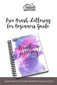
Download my free Brush Lettering for Beginners Guide (PDF) here: https://yourcreativeadventure.com/brushlettering/
Get your copy of my Brush Strokes Workbook here: https://yourcreativeadventure.com/workbook/
You can see the pens I recommend for beginners in this post: https://yourcreativeadventure.com/brush-lettering-pens/
Keep Reading


Leave a Reply